PROJECT SCOPE
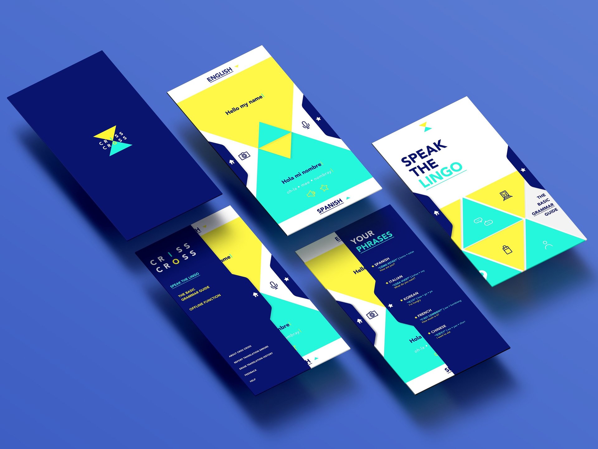
Criss Cross
Hi-Fidelity Prototype
CLIENT
Student Brief
PROJECT DURATION
2.5 weeks
"Criss Cross to the other side" – reimagining translation for younger users: more interactive, curious and fun.
ROLE
UI Designer
YEAR
2017
Criss Cross began as a student project during my time as a graphic design student, when I had minimal exposure to UX design. The brief was open-ended, and I took it as an opportunity to explore how something traditionally utilitarian—like a translation app—could be reimagined as a more playful and visually expressive experience for younger users. I designed and prototyped the app independently, and recently revisited the project to address its early UX limitations.
My updated version now reflects what I’ve since learned about usability, accessibility, and functional design thinking.
Problem
The project was driven by a simple assumption: that there could be a more fun and engaging translation app than what currently exists on the market. Many of the dominant tools—while effective—felt overly functional, uninspiring, and visually flat. I saw an opportunity to explore how translation could feel more playful and curiosity-driven, especially for a younger, design-aware audience.
This reframed the problem from:
“How do we translate text efficiently?”
to
“How might we reimagine translation as a more enjoyable and visually engaging experience—without compromising clarity or usefulness?”
Design Process & Decision-Making
The original design leaned into visual experimentation—bright colour palettes, bold typography, and swipeable interactions. At the time, my focus was on creative exploration, not user testing or usability standards. While the visuals were well received, the experience lacked core UX considerations like clear hierarchy, accessibility contrast, and intuitive navigation.
With more experience under my belt, I revisited the project and improved several key areas:
Accessibility: Adjusted colour contrast and text sizing for better readability; simplified interactions for better cognitive flow
Usability: Refined navigation patterns, introduced clearer feedback states, and streamlined the translation flow
Functionality: Added utility-focused features like saved phrases, simplified language toggling, and contextual cues to help users understand the meaning of a phrase (e.g. tone, use cases)
I reworked the prototype in Figma, applying usability heuristics and principles I’ve since adopted. Rather than purely aesthetic choices, design decisions were now driven by both empathy and utility.
The evolved version of Criss Cross is a much more well-rounded product. It retains its vibrant personality and appeal for younger audiences, but now delivers a clearer, more usable experience. It includes better affordances, more useful interactions, and a more accessible visual system.
While it remains a conceptual project, it represents a meaningful milestone in my design growth—showing how my understanding of design has shifted from visual styling to holistic product thinking. This update turned a visually interesting idea into a much stronger example of user-centred thinking.
Outcome & Impact
This project taught me how to look critically at my own work and identify what’s missing—not just visually, but in terms of usability, accessibility, and product thinking. It’s a reminder that design is never really “done”—and that creative expression becomes far more impactful when it’s paired with empathy, clarity, and function.
Learnings & Takeaways
Overview
PORTFOLIO: TRAVEL WITH JANE >
< PORTFOLIO: CRISS CROSS