PROJECT SCOPE
Travel with Jane
UX Research, Design, Prototype & Usability Testing
CLIENT
Lucy Chen – Head of UX at Insured by Us (IBU)
PROJECT DURATION
3 months
A travel Insurance mobile app for female travellers:
more than insurance but a thoughtful companion for Australian women who roam.
ROLE
UX/UI Designer & Stakeholder manager
TEAM
Rachel Wilks – Lead UI Designer
Wayne Stammers – Product Advisor & UX Designer
2018
YEAR
This was a project with Insured by Us (IBU), the team behind Travel with Jane — a travel insurance platform designed to support Australian women on the move. IBU approached us with a solid foundation: they had already invested in a wealth of research to understand their customers’ travel behaviours, pain points, and digital expectations. With this insight-rich base, they asked us to revisit their existing mobile app prototype with two clear goals:
Restructure key content — including Claims, FAQs, and Safety Information — to improve discoverability and create a more intuitive navigation experience. They also wanted to explore how the app could provide additional value and position itself somewhere between a traditional insurance product and a travel platform like Tripadvisor.
Reimagine the digital claims experience to feel more human, flexible, and supportive — shifting away from a cold, transactional model and toward one that feels like real help during moments of stress or uncertainty.
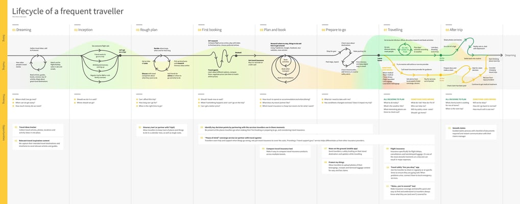
Defining the problem
We began by diving into the extensive research provided by Insured by Us (IBU). Their groundwork was solid — they had developed detailed personas, mapped out the traveller journey, conducted one-on-one interviews, and even built and tested a prototype with real users. Their research offered us a rich understanding of who their users were and how they experienced travel insurance in real life.
Overview
At first glance, the brief seemed fairly straightforward: restructure key content — like Claims, FAQs, and Safety Information — so users could navigate it more intuitively. But as we reviewed the interview transcripts and behavioural feedback, a deeper insight began to emerge: users weren’t just struggling with navigation — they were questioning the product’s value altogether.
To many travellers, insurance felt like a necessary but forgettable checkbox, a costly product they hoped they’d never need. Even when the app worked, it wasn’t working for them. It didn’t feel helpful, proactive, or human.
The real challenge wasn’t just improving wayfinding, it was reframing the product as something useful and reassuring, even when a claim wasn’t being made.
For instance, several users responded positively to the idea of a live chat feature, not as a generic customer support tool, but as a direct connection to a real, travel-savvy person who could help in stressful situations. Others emphasised the importance of having everything in one place: policy information, emergency contacts, travel alerts — a trusted, centralised source for peace of mind while on the move.
This insight reframed the challenge from:
“How do we reorganise the app’s insurance content?”
to:
“How might we design a helpful, human travel companion that builds trust before something goes wrong?”
This shift in focus also aligned perfectly with IBU’s broader vision: to evolve from a transactional insurance provider into a travel support platform — one that blends the reliability of insurance with the day-to-day usefulness of something like TripAdvisor. Not just a product, but a partner.
After synthesising our research insights, one thing became clear: travellers didn’t just want an easier claims process — they wanted their travel insurance experience to fit naturally into the way they plan and manage their trips.
The team started with a working prototype focused on simplifying claims through a live chat function. It was a strong foundation, but we quickly saw it as just the beginning. So, we asked ourselves:
What else would make a travel insurance app genuinely valuable, not just during emergencies, but across the entire journey?
The breakthrough came when we shifted our mindset from insurance as a product to insurance as part of the travel experience.
That perspective led us to three key features:
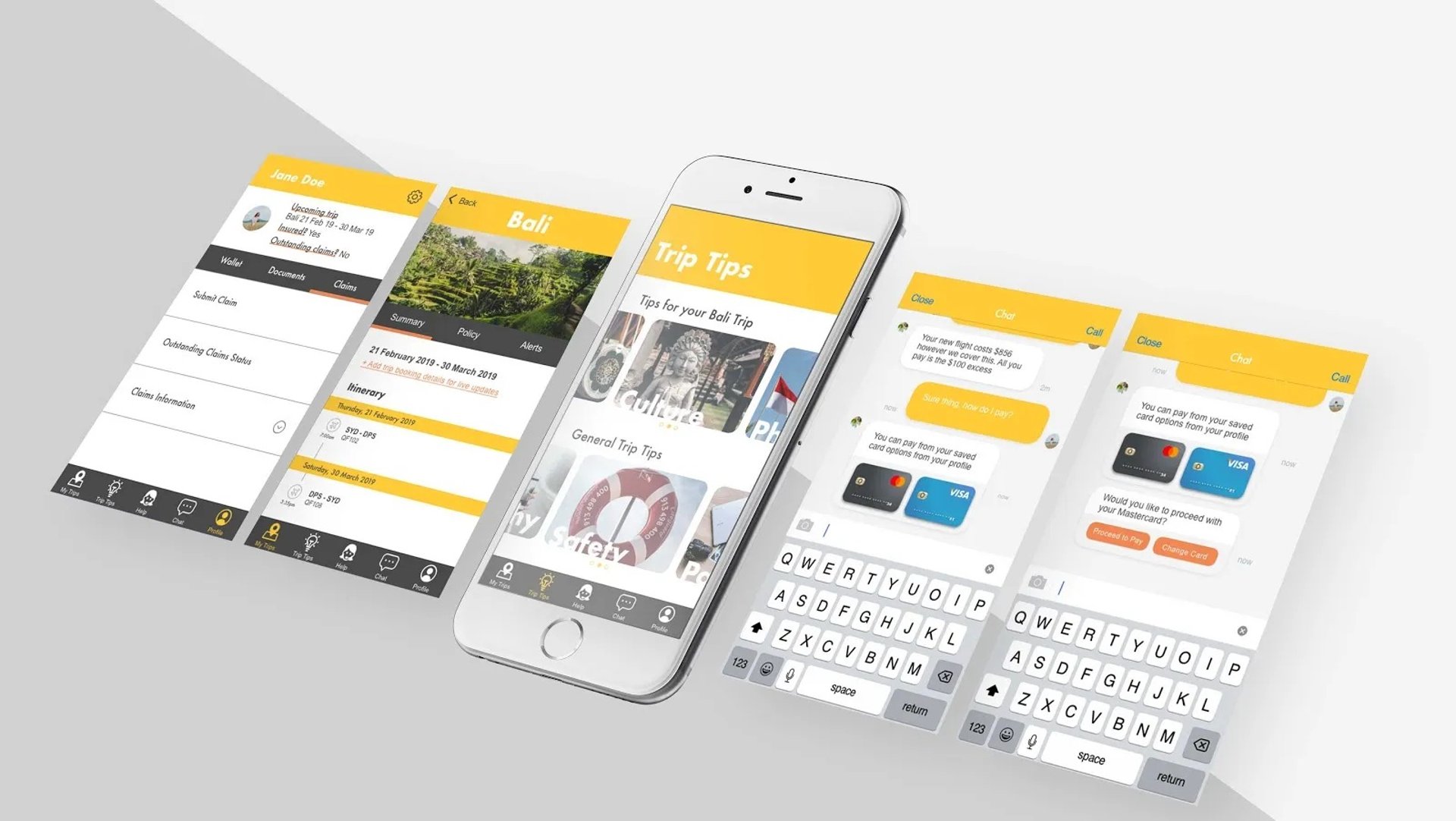
1. Profile: A Personal Hub
At first, a Profile section seemed obvious — but we challenged that assumption. Did we actually need one?
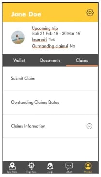
The answer turned out to be yes, and for more than one reason. Travellers often need quick access to key documents such as policy confirmations, receipts, or even passport scans, especially in stressful moments. The Profile became a trusted hub, and we added thoughtful touches, such as pre-filled data to simplify future claims and purchases.
I led the UX design for this section, wireframing user flows and testing them to ensure the experience felt fast, clear, and low-effort, exactly what users wanted when they were on the move.
2. My Trips: Making Insurance Part of the Plan
Next, we reimagined the trip planning process. Instead of leaving insurance as a background task, we embedded it directly into trip planning. As users added flights or accommodation, the app prompted them to purchase and store their travel insurance for that specific trip.
This made insurance feel like a natural, integrated step, not a separate obligation. We also surfaced relevant, geo-specific safety alerts and content right within each trip, ensuring users only saw information that applied to where they were going, and when.
3. Smart Content: Timely and Relevant
We didn’t want to serve generic travel tips: there are already plenty of blogs for that. Instead, we designed a context-aware content system. Travellers received tailored tips and advice based on their destination, timing, and type of trip, offering value at just the right moment.
Evolving the Claims Experience
We also made several key decisions that helped elevate and clarify the claims journey:
Claims FAQs: Initially debated under “My Trips,” we eventually grouped them under Profile. This made sense contextually — claims are deeply personal and often occur after travel. Keeping related content together simplified access and supported mental models.
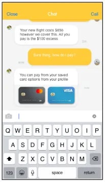
Payments in Chat: One common pain point in the original prototype was excess payments. Users had to follow a separate link and re-enter card details, which disrupted the flow. Now that Profile included stored card info, we designed a new interaction that allowed travellers to authorise payments directly within the chat interface. I prototyped and tested this flow with users, and the feedback was clear: it significantly streamlined the process and reduced friction.
Outcome & Impact
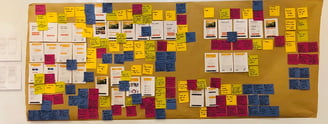
Our usability testing sessions weren’t without hiccups: from shaky Wi-Fi to a few prototype glitches, the start was a little bumpy. But once sessions got underway, the value was immediate. We began to see which ideas truly resonated and where we still had room to grow.
The biggest win? A small but powerful tweak to the claims payment flow. By enabling users to make excess payments directly within the chat — using pre-saved credit card details from their Profile, we created a moment of real delight. Several users actually said “wow” out loud. It was a subtle shift, but it reframed the chat experience: no longer just a communication tool, it now felt like a smart, helpful assistant. That moment of delight validated a core part of our vision, that small, thoughtful touches can go a long way in creating an effortless but crucial experience.
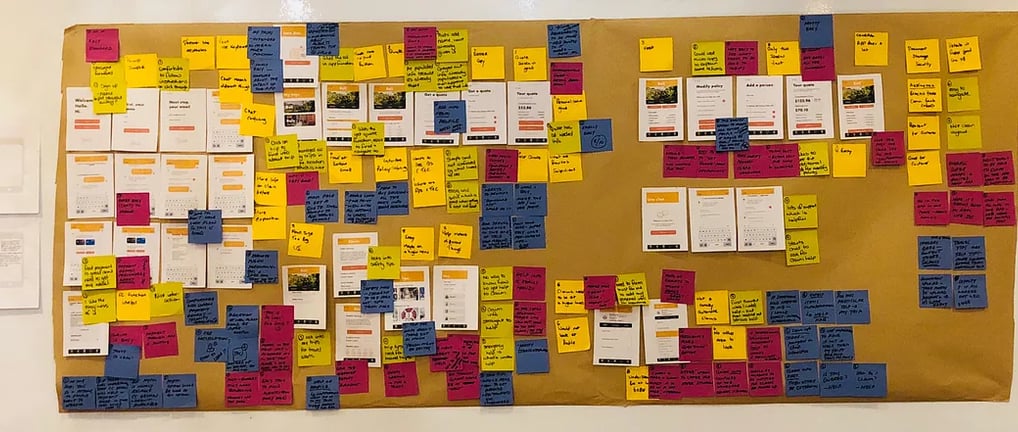

The Profile feature also tested well. Users appreciated how the app remembered their details and offered streamlined access to documents and pre-filled forms. They told us they were willing to invest a bit of time upfront, as long as the app clearly showed its value in return. For a product that depends on user trust and engagement, this was a key signal that we were heading in the right direction.
That said, not everything worked as intended. The Claims feature, while central to the app, felt buried and confusing to many users. Some expected to start a claim from their Profile. Others assumed it belonged in Help. The issue wasn’t just about labelling, it was about expectation. Because so much of the app felt smart and anticipatory, users expected the same level of clarity and responsiveness from the claims experience — and we weren’t quite there yet.
Still, the overall feedback was enthusiastic. Multiple testers asked when the app would be available to download, a strong sign of product-market fit starting to emerge.
More importantly, testing gave us a clear roadmap for future improvements, including:
Smarter, more visible claims flows
Quick links for key actions
Geo-mapped help services
A thoughtful onboarding experience to build trust from day one
Still, the overall sentiment was enthusiastic. Several testers asked when the app would be available for download — a clear sign of product-market fit emerging. The testing not only validated our direction but also gave us a strong roadmap for iteration: smarter claims flows, quick links, geo-mapped help, and onboarding education to build deeper trust and long-term engagement.
Usability testing didn’t just validate the work, it sparked momentum and confirmed that we were designing something users could genuinely rely on.
Learnings & Takeaways
One of the biggest takeaways from this project was just how powerful robust foundational research can be. We were handed incredibly detailed insights — not just about what users were doing, but how they were feeling throughout their journey. That emotional clarity gave our team a clear north star, keeping us aligned and purposeful in every design decision.
We also learned that the smallest changes can drive the biggest shifts in perception. The brief had room for a complete redesign, but it was a subtle, thoughtful improvement that had the most impact. Replacing a clunky payment link with an in-chat, pre-filled form transformed a frustrating moment into one that felt fast, seamless, and trustworthy. It was a reminder that experience is perception, and great design often lies in the details.
Then there was Claims. We thought we’d placed it logically, tucked away under Profile, but users didn’t engage with it. In hindsight, we’d unintentionally buried it, likely because we saw it as the driest part of the product. That misstep taught me a valuable lesson: in trust-heavy products like insurance, the most essential features need to be treated with clarity and confidence, not hidden away just because they’re not “fun.”
Ultimately, this project reinforced the importance of designing with empathy, transparency, and communication — especially when you're asking users to give you something valuable in return: their time, their data, and their trust.
This project was one of those projects where I could really see a product working FOR the user — and with the user at the core. Travel insurance, as important and crucial it is for every traveller, most people put it off and off to purchase it. Even if they do purchase it well in due time, the immediate value of it is not clear…and probably never will be, until they are in a predicament when they need it the most. So, Travel with Jane — the travel insurance app that doubles as a travel planner, and triples as a TripAdvisor — was a game-changing concept.
Thank you to Travel with Jane for an amazing product that puts travellers first, that endeavours to break the preconceptions people have about travel insurance, and that they are there to work hard FOR them, not to withhold money from them. A product that strives to empower women to see the world safely and smartly — our team wishes the product the very best...and please launch soon!
Design Process & Decision-Making
One of the biggest usability challenges was the Claims information architecture. Users consistently struggled to locate where and how to start a claim, indicating a need to rethink both placement and flow to make this essential feature more visible, relevant, and intuitive.
If we had continued with the next iteration, here’s where we would have focused:
Pre-populated claims options
Based on user expectations during testing, the next prototype would introduce a smart claims form. Users could select from a list of common claim types, with relevant fields pre-filled where possible, reducing friction and effort during an already stressful time.Expanded self-service functionality
While version 1.0 leaned heavily on the chat experience (with a claims agent or chatbot), version 2.0 began introducing features users could access independently, like getting a quote or purchasing insurance. We saw a clear preference for self-service, so future iterations would include pre-emptive options and shortcuts to help users complete tasks quickly, without relying on chat.Dashboard with shortcut links
A centralised landing page with shortcut tiles for key actions (like “Make a Claim,” “Check Alerts,” or “View Policy”) would give users immediate access to high-value features, reducing time spent hunting through menus.Notification indicator
A subtle push notification bubble (e.g., on the app icon or Claims section) would alert travellers to new claim updates or safety alerts they’ve snoozed, helping re-engage users and make the app feel more alive and responsive.Geo-mapped Help facilities
Instead of a static Help page listing general emergency numbers, we envisioned a location-aware Help tool — one that could surface nearby consulates, pharmacies, or hospitals, tailored to the user’s current location.App tutorial and onboarding
While the learning curve was minimal, we saw clear value in providing a lightweight, step-by-step tutorial. Educating users upfront on how to get the most from the app — particularly how to pre-fill information and upload documents — would empower them to take full advantage of its features. This also supports client goals, increasing engagement, retention, and long-term value.